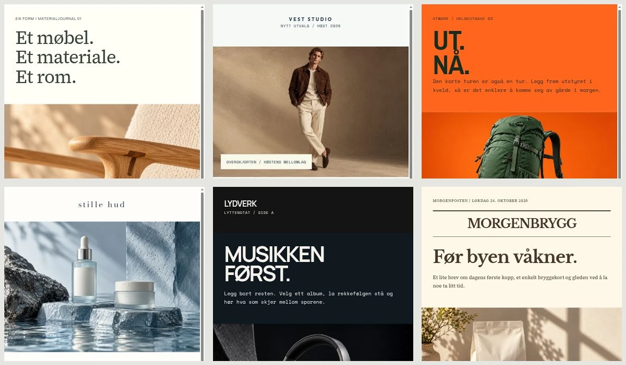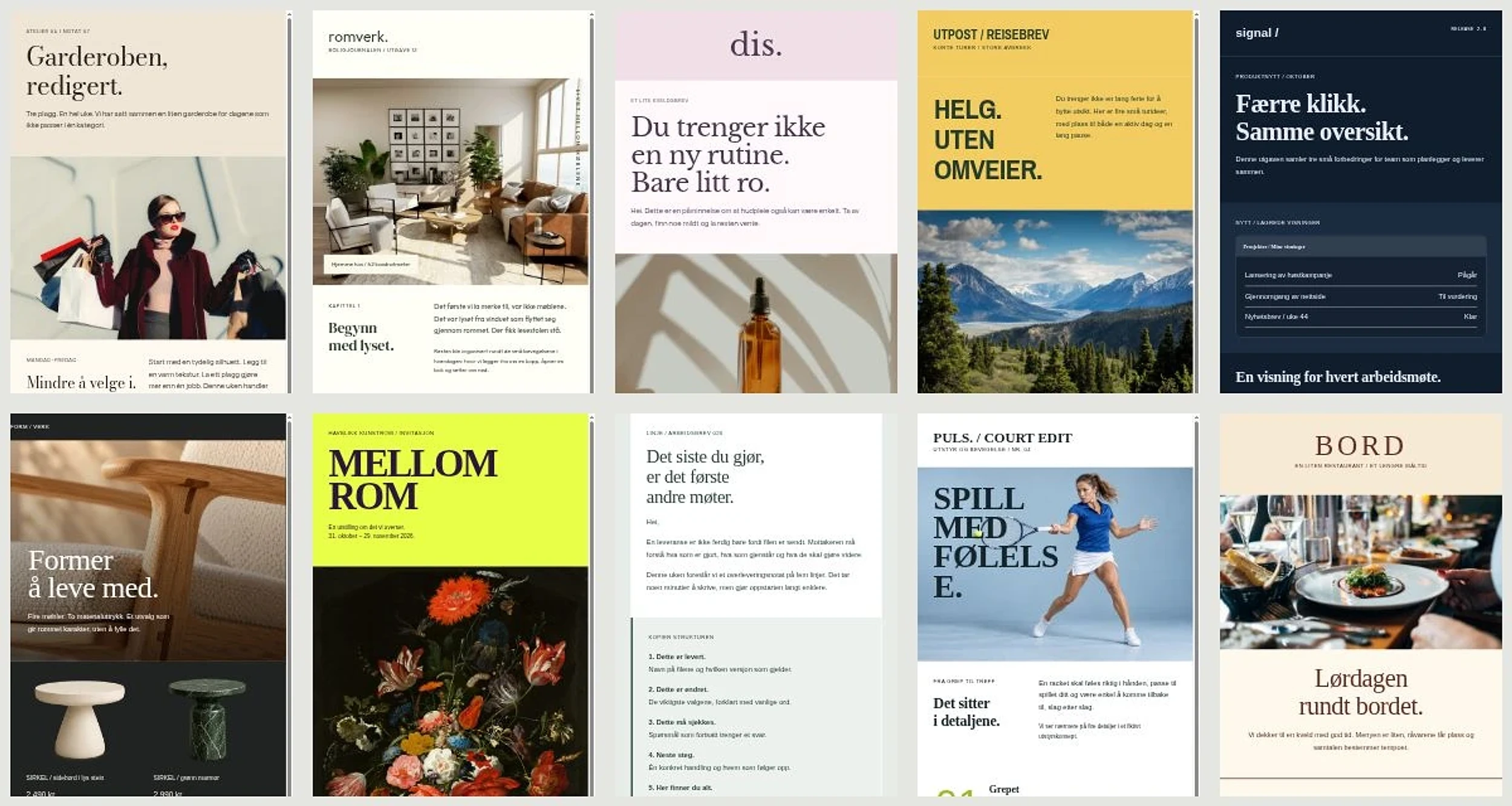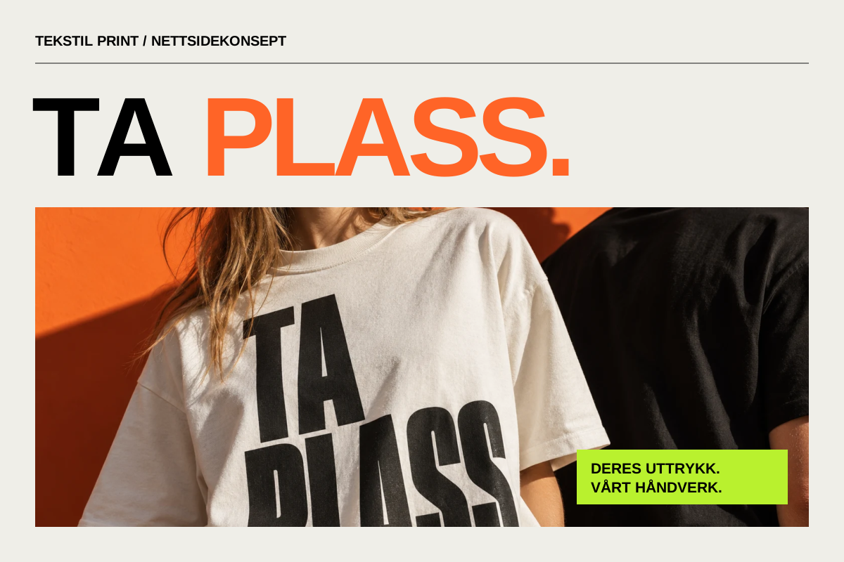
A design idea can look strong in one mockup and fall apart as soon as it has to work on a phone, in an email or in print.
I ran into this recently while developing a campaign concept built around one simple hand-drawn element continuing into a finished piece of design. The first composition worked as a single image. The problem appeared when the same idea had to extend into a website, app, brochure, email and e-commerce environment.
That forced a clearer definition of the idea itself. If a concept only works when the subject sits in exactly the same place inside one specific composition, we may have made a good layout rather than a robust visual system.
Separate the idea from the layout
A layout describes where elements sit in one format.
An idea describes the relationship between those elements.
That might be the transition from sketch to finished execution, a contrast between raw and refined material, or an object that changes meaning when it enters a different environment.
The distinction matters because the format will change.
On a wide desktop canvas, an image may sit beside the text. On mobile the two may need to stack. In a brochure the idea can unfold across a spread. In email it has to survive a narrower and more technically constrained structure.
If the concept still makes sense after those changes, it is stronger than a composition that only survives in one presentation.
Channels have different physical rules
It is tempting to create one master layout and simply scale it.
That rarely works well.
On the web, media queries are used to change layout in response to viewport and device characteristics. MDN describes them as a core part of responsive design. The composition is expected to adapt, not merely shrink.
HTML email has a different set of constraints. Can I Email maintains client-by-client support tables for HTML and CSS features because support varies between email environments. An effect that works comfortably on a website may need a simpler fallback in email.
Print introduces another production model. Adobe describes bleed as artwork extending beyond the final trim area so edge-to-edge graphics do not leave white gaps after cutting.
These are three different environments.
The design idea can remain consistent while the execution changes.
Define what cannot disappear
When I test whether a visual idea can become a system, I try to identify one or two properties that have to survive on every surface.
They might be:
- a particular transition between two visual states
- a recognisable relationship between drawing and photography
- a typographic contrast
- a compositional rule
- a way an object breaks a frame
- a specific sequence or transformation
These are the invariants of the concept.
Colour, scale, placement, cropping and information density can be allowed to change.
If everything is fixed, the system becomes fragile. If nothing is fixed, it loses identity.
Build a rule, not a template
A template says: put the logo here, the image there and the text in this box.
A rule explains why the elements belong together.
In the campaign example built around sketch and finished execution, that distinction became important. The interesting part was not that half the canvas always had to be sketch and the other half finished design. That quickly became mechanical.
The stronger rule was that one simple sketched element should act as the beginning of something more resolved, and that the transformation should make sense in the surface where it appeared.
On a landing page, the sketch can develop into a digital section. In a brochure it can become a finished advertisement. In email it can resolve into a compact campaign module.
The idea is the same. The composition is not.
Test the extremes early
I used to be more likely to start with the main format and adapt everything else afterwards. With more complex concepts, it is more useful to test the extremes early.
Four surfaces reveal a lot:
1. a large desktop or presentation canvas 2. a narrow mobile screen 3. a dense channel such as email 4. a fixed print format
If the idea only works on the first one, it should be adjusted before the rest of production begins.
This test often reveals what is actually carrying the concept. Perhaps the large background was not important. Maybe the real idea sits in the transition between two materials, in the typography, or in the way an element moves from rough sketch to finished execution.
Consistency does not mean sameness
Visual consistency is often confused with identical layouts.
A useful system can look different from one surface to another and still remain recognisable.
In my design reference system, scalability means the ability to build a coherent family across content, sizes and channels, rather than simply enlarging the same graphic. That distinction is useful when judging a concept before production.
The website can use more space and motion. Email can be flatter and simpler. A brochure can use the full spread. A small mobile module can reduce the concept to one subject and one headline.
What matters is that the reader meets the same visual logic.
This resembles the way a visual identity works, but campaign design often applies a stricter test: the idea must work quickly, at many sizes and with content that changes more aggressively.
A five-point test before production
Before rolling an idea out across many formats, I now try to define five things:
**1. What is the idea in one sentence?** If it can only be described as a layout, it is probably too dependent on the format.
**2. What must always remain?** Choose one or two visual properties that carry the concept.
**3. What is allowed to change?** Define which elements can move, simplify, crop or change form.
**4. Where does the idea break?** Test small mobile, email, print and other difficult surfaces before building the full system.
**5. Is there a simple fallback?** If a channel cannot support motion, advanced CSS or a complex composition, the idea should still be understandable.
The best test is not the hero mockup
A hero mockup is usually designed to show a concept at its best. That makes it a poor single piece of evidence that the idea works.
I trust the difficult formats more.
If the concept remains clear when the space becomes smaller, the technology simpler and the content denser, it is probably strong enough to develop further.
At that point, the design idea has stopped being one good image and started becoming a system.