Design project, Brand guidelines
Bergon Brand Identity & Guidelines
Brand guidelines for Bergon covering the logo system, colour, typography and rules for print and digital use.
View on Behance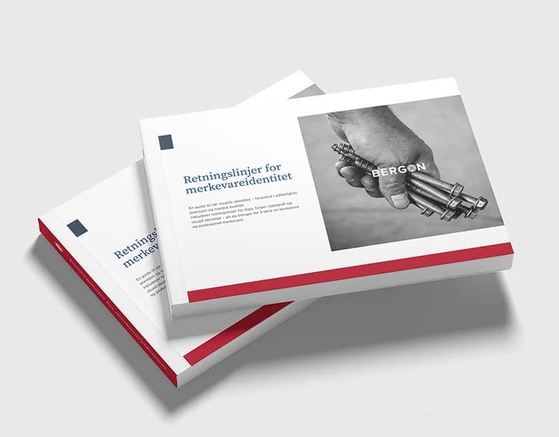
Context and challenge
When several people use a visual identity, the rules need to be easy to understand. The logo, colours and typography must be used consistently in print and digital applications.
My role
I brought the logo, colours, typography and practical rules together in a simple design manual.
Creative concept
The identity is treated as a set of usable rules across teams and formats, rather than a collection of logo variants.
Design strategy and decisions
The manual covers logo construction, clear space, colour values, typography and examples for print, packaging and screens.
Outcome and deliverables
The manual makes the identity easier to use consistently by collecting rules for the logo, clear space, colours, typography and practical examples.
Relevant to your project?
CONTACT
Working on something similar?
design@samthomas.noKrigsjåveien, 5163 Bergen, Norway