Concept project, Self-initiated rebrand
Engesund Fiskeoppdrett: Brand Identity
Brand identity for a family-run fish farm on the Norwegian west coast, built around heritage and clarity.
View on Behance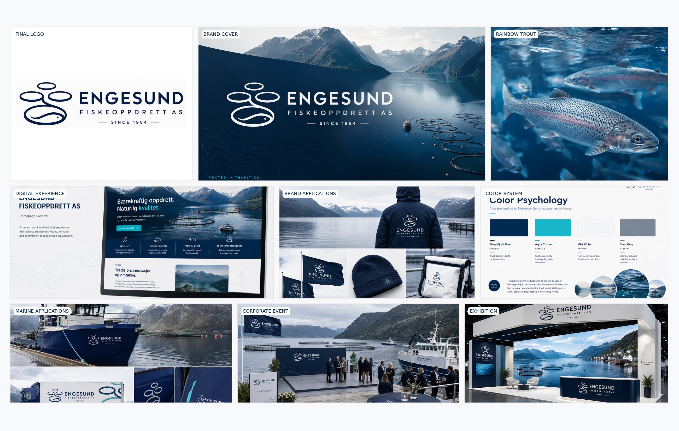
Context and challenge
I present this project because aquaculture is a specialised field that often relies on the same visual symbols. The aim was to find an identity relevant to the business without becoming generic.
My role
I developed the logo, colours, typography and a complete identity system, showing how it could work on the web, company material, exhibitions and events.
Insight and problem framing
For a business associated with aquaculture, place can become a useful source of visual distinction. This self-initiated proposal uses the Norwegian coast as a design premise, not as a verified insight from Engesund customers.
Creative concept
An identity system translating the coastal context into a coherent visual language. The proposed mark, typography and colours are designed to extend from digital communication to corporate and exhibition materials.
Design strategy and decisions
The logo and visual language draw on the business's field and coastal connections. The system was then tested on small and large applications.
Art direction and visual language
The direction relies on a restrained and repeatable visual vocabulary. Colour, typographic hierarchy and imagery need to function in small informational formats as well as large presentation surfaces. Repeated visual cues connect the different applications.
Outcome and deliverables
The identity is tested on everything from small digital applications to workwear, packaging and material for exhibitions and events.
Reflection and learning
This self-initiated concept demonstrates system thinking and potential applications. It does not document a commission, implementation by Engesund or measured business outcomes.
Relevant to your project?
CONTACT
Working on something similar?
design@samthomas.noKrigsjåveien, 5163 Bergen, Norway