Design
Does the identity work when the logo cannot do everything?
A visual identity needs to work beyond the logo itself. GLØD shows how typography, colour, illustration and composition can carry the identity further.
Concept project, Visual identity
A self-initiated coffee brand concept with a black wordmark, an orange Ø and applications across packaging, menus and space.
View on Behance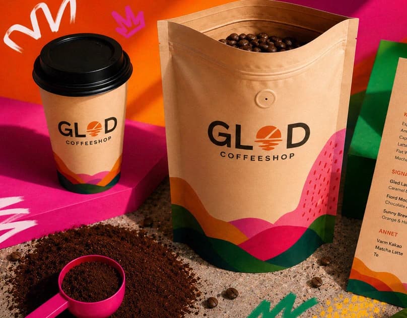
I present GLØD to show how a brand can be developed as a complete system, rather than just a logo.
I developed the name, wordmark, colours, patterns, typography, tone and applications for the self-initiated concept.
A café identity needs to remain recognisable across radically different scales, from a takeaway cup to environmental signage. This observation guides the concept; it is not presented as a field-research result.
A distinctive wordmark and consistent colour cue form a flexible identity for GLØD. The orange Ø acts as a visual anchor that remains recognisable as other elements change.
The black wordmark and orange Ø create a simple identifying feature. The same visual language runs through cups, bags, menus, signage and digital applications.
The black wordmark and orange focal point establish a clear hierarchy. Illustration, patterns and changing surfaces add expressive range, while the recurring typographic feature connects packaging, menus, signage and digital formats.
The logo, colours, pattern and tone remain consistent across cups, bags, menus, signage and digital applications.
The work demonstrates both an immediate identifying feature and a wider system of applications. GLØD is a concept project; no commercial launch or audience-response data is claimed.
Design
A visual identity needs to work beyond the logo itself. GLØD shows how typography, colour, illustration and composition can carry the identity further.
CONTACT
Krigsjåveien, 5163 Bergen, Norway