Concept project, Visual identity
INFRANODE
Identity system for an infrastructure company, built around a modular mark and a clear visual structure.
View on Behance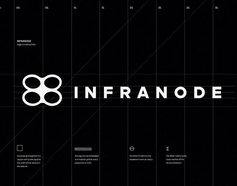
Context and challenge
An infrastructure company needs an identity that feels clear and professional on both small digital applications and large signage.
My role
I developed the identity from the symbol and grid to typography and usage examples in small and large formats.
Creative concept
A modular identity combines industrial precision with scalability from small digital icons to large signage.
Design strategy and decisions
A modular symbol and grid make the identity suitable for small digital applications and large signage, with a limited palette and clear typographic hierarchy.
Outcome and deliverables
The modular system maintains the same identity from small digital formats to large signage without losing clarity.
Relevant to your project?
CONTACT
Working on something similar?
design@samthomas.noKrigsjåveien, 5163 Bergen, Norway