Concept project, Visual identity
Sulefisk: A Place-Driven Brand Identity
A visual identity concept for Sulefisk, inspired by the Norwegian fjord landscape.
View on Behance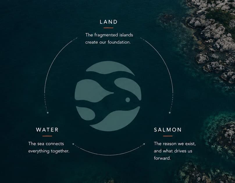
Context and challenge
A business with strong connections to place and nature needs a relevant identity without using the same literal industry symbols as everyone else.
My role
I developed the logo, colours and visual system inspired by the place and coastal landscape.
Creative concept
Coastal landscape is translated into colour and form rather than generic industry symbols, creating a coherent place-led identity.
Design strategy and decisions
The concept uses colours and forms from the coastal landscape in the logo, packaging, workwear and digital formats.
Outcome and deliverables
The identity brings the logo, colours, packaging, workwear and digital applications together with a clear connection to the place.
Relevant to your project?
CONTACT
Working on something similar?
design@samthomas.noKrigsjåveien, 5163 Bergen, Norway