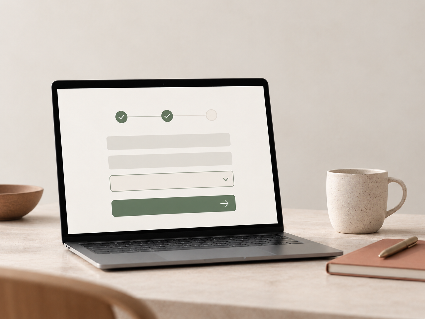
A contact form may be small, but its task matters. It is often the final step before someone sends an enquiry, requests a quote, creates an account or completes an order.
If the form creates uncertainty at that point, a well-functioning website elsewhere is of little help. Good form design makes the task understandable from the first field to the confirmation after submission.
Ask only for information that is needed
Every additional field is another task for the user.
If the business only needs a name, email and short message to begin a conversation, asking for a phone number, company, job title, address and budget together is rarely necessary.
Shorter forms are not always better. A quotation form may need more information than a contact form. But every field should have a clear purpose and be used in the subsequent process.
Field labels need to be clear
An 'Email' placeholder may look tidy, but disappears when the user starts typing.
A permanent field label makes the field's purpose easier to remember. It can also be linked programmatically to the field so assistive technologies understand the relationship. W3C recommends clear labels for form controls and an explicit connection between text and field.
Users should not have to remember or guess what belongs where.
Make required fields clear
Required fields should be identifiable before users press 'Send'.
W3C notes that an asterisk alone may be insufficient. It can be overlooked visually and is not always communicated clearly by a screen reader.
The requirement should therefore appear both visually and in code. If almost every field is required, marking the few optional fields may be clearer. Consistency matters most.
Error messages should help users continue
'Invalid value' describes an error without explaining how to fix it.
More useful messages are specific:
- 'Enter an email address, for example name@company.no'
- 'Enter your name'
- 'Choose an option before continuing'
GOV.UK Design System recommends short, specific error messages using the same language as the field. W3C also recommends clearly identifying errors and helping users correct them.
The message should appear near the relevant field, rather than only in a general error list at the top.
Keep information already entered
If one field has an error, the rest of the form should normally retain its content.
This reduces repeated work and makes correcting the specific error easier. W3C's accessible-forms guidance identifies this as good practice.
Validation involves both user experience and security
Some errors can be detected directly in the browser, such as an empty required field or an incorrectly formatted email address. This provides quick feedback.
Client validation is nevertheless not a security mechanism. Data also need validating on the server.
Forms clearly show how design and development meet: users need fast, understandable information, while the system needs to handle submitted data safely.
After 'Send', users need an answer
A form is not finished when the button is pressed. Users need to know whether the message was sent, what happens next and whether anything more is required.
A failed submission also needs to be clear. A button that stops without explanation, or a page that returns to the form, creates uncertainty.
A short confirmation can be enough, provided it is unambiguous.
Test the entire task
A form should not be assessed only as a screenshot in a design file.
Use a keyboard. Leave a required field empty. Enter an invalid email address. Submit from mobile. Test a slow connection and submission errors. Finally, check that confirmation actually appears.
This tests the full task users need to complete, rather than only its fields.
The best forms need little attention. They explain what is required, help when something is wrong and clearly confirm completion.