Can visitors do what they came to do?
A visitor needs to find information, open a menu or send an enquiry. I would start an accessibility review with those tasks. Can someone complete them without a mouse? Is the text readable? Does the page still work when content is enlarged?
For a business, these are practical questions about how its website works. An accessibility button can offer useful options, but its presence alone does not demonstrate an accessible website.
Navigation without a mouse
WCAG 2.1.1 addresses operating functionality through a keyboard interface, with a limited exception for functions that require a particular movement path. This matters when designing menus, forms and other actions.
WCAG 2.4.7 also requires visible keyboard focus. People need to see which element will respond when activated. In a review, I would follow the whole route from navigation to the main action, rather than stop at the first button.
Readability and room for larger content
WCAG 1.4.3 generally requires contrast of at least 4.5:1 for ordinary text and 3:1 for large text, with defined exceptions. Colours need to be measured in their actual states.
WCAG 1.4.10 concerns content reflow at a narrow viewport without losing information or functionality, except for content requiring a two-dimensional layout. A page can look orderly on a large display and still fail when content and controls are enlarged.
My practical recommendation is to try common tasks with larger content early. Look for clipped text, overlapping buttons and information that becomes difficult to reach.
Northline as an example
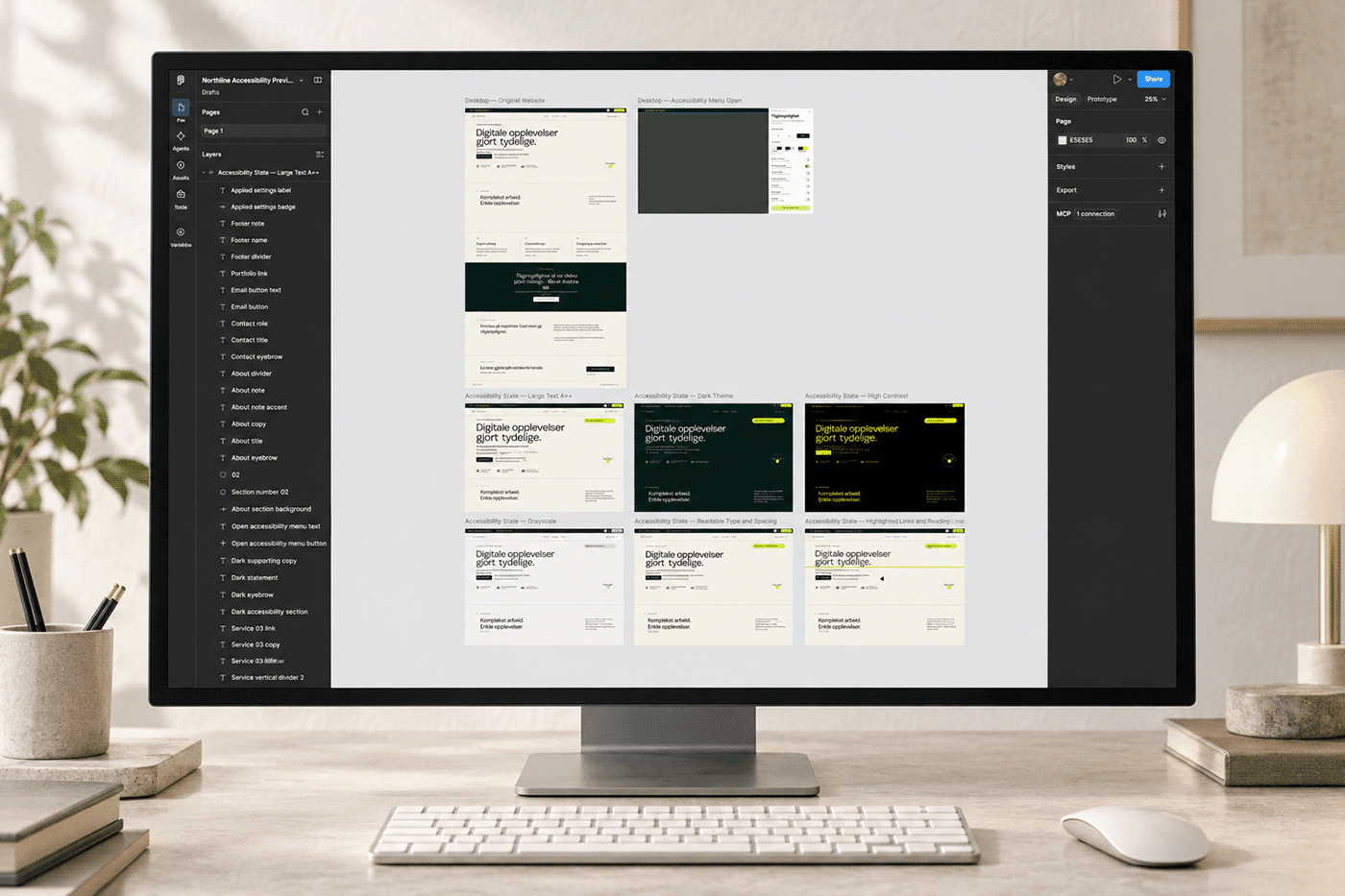
Northline is a concept project and interactive demonstration I created. It explores personal display preferences including text size, contrast, spacing and reduced motion.
The project presentation also describes work on keyboard navigation, visible focus and page structure. My role covered UX/UI, visual identity, interaction and the front-end concept.
It is a learning and demonstration project, not independent verification of WCAG conformance. It does not establish that every feature works with every assistive technology.
Test the tasks that matter
W3C explains that automated tools alone cannot determine whether a website is accessible. Human evaluation is necessary.
I would combine technical checks with specific tasks: find a service, open and close the menu, complete a form and correct an error. Examine keyboard and screen-reader use, and involve people with relevant access needs where possible.
The outcome should be a record of real barriers, prioritised fixes and checks after changes. Display preferences can help, but the underlying experience still needs attention.
Want to take a closer look at your website?
We can start with the pages and actions that matter most to your customers, then agree what to investigate and improve. The Northline project below shows one approach I have explored.