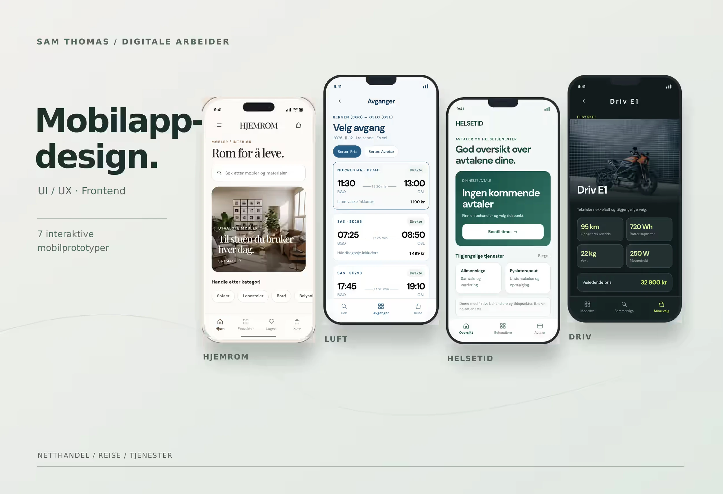
A prototype can look finished in a presentation and still fail the moment someone tries to use it. A control responds to a mouse but not to a finger. A horizontal surface drags correctly on desktop but locks on a phone. A transition looks smooth when it plays automatically, yet breaks when the user interrupts it halfway through.
I have run into this pattern repeatedly in recent interactive web and prototype work. The common factor is that the problem is not primarily the appearance of the screen. It is the behaviour between screens.
A screen is not an interaction
It is easy to review a digital design as a sequence of still frames: home page, product view, menu, modal, confirmation. Users do not experience a product as a folder of screens, though. They experience actions and responses.
What happens when a finger hits the control? What happens if a movement starts but is not completed? Can the user reverse the action? Does the interface retain a valid state after an error? Does the same action work with mouse, touch and keyboard?
A prototype that only shows end states can still be useful for visual review, but it tells us little about the interaction itself.
Visual polish can hide behavioural faults
An animation can look smooth when it runs as a predetermined sequence. That does not mean it works when a user controls the timing.
A real interface has to handle interruption. Someone may drag a little and release, change direction, tap twice, rotate a phone, open a menu during a transition or start a new action before the previous one has finished.
If the prototype is only checked through the perfect sequence, these problems stay hidden.
I find it useful to separate two kinds of review:
- visual QA: typography, contrast, spacing, hierarchy and composition
- interaction QA: input, response, state, interruption, errors and transitions
Both matter. They reveal different classes of problems.
A mouse and a finger are different test conditions
The same web interface may be used with a mouse, trackpad, finger, stylus and keyboard. MDN's documentation on Pointer Events describes why the web platform needs an input model that can handle multiple pointing devices.
That does not mean the devices behave identically.
A mouse has hover. A finger does not work that way. A mouse pointer is precise, while a finger covers a larger target area. On mobile, horizontal drags and swipes may also compete with normal scrolling and browser gestures.
W3C guidance on input modalities notes that users may switch between input methods and that functionality should not depend on one complex gesture.
In practice, an interactive element should be tried on the real device, rather than only inside a desktop preview set to a mobile width.
Drag and swipe need alternatives
Interactive concepts often use drag because it feels direct. A user moves a card, scrubs a timeline or swipes between products.
Dragging is still a more demanding action than a simple tap.
WCAG 2.2 includes a specific success criterion for dragging movements. When functionality depends on dragging, it should generally also be achievable with a single pointer without dragging, unless the drag itself is essential.
That produces a useful design rule beyond accessibility compliance: if swipe is the only way to progress, ask whether the interface should also provide arrows, buttons, pagination dots or another explicit control.
An alternative does not necessarily make the experience less elegant. It can make the interaction more robust.
Test the transition, not only the endpoints
When an element transforms from one state to another, it is tempting to check only that the first and last frames look correct.
Much of the quality sits in the middle.
I look for:
- whether the direction of movement is understandable
- whether objects keep a logical spatial relationship
- whether text moves without colliding with content
- whether an interrupted movement returns to a valid state
- whether the next action can start before the previous animation finishes
- whether reduced motion or a simpler variant is needed
- whether the interaction still makes sense without the animation
The final point matters. Motion can explain how two states relate, but the function should not become incomprehensible if that motion is reduced or does not play as expected.
The product also exists between the main screens
The same principle applies to states that rarely appear in polished design presentations.
What does the user see while content loads? What happens when something is missing? What does an empty list look like? What happens when an action succeeds, or cannot be completed?
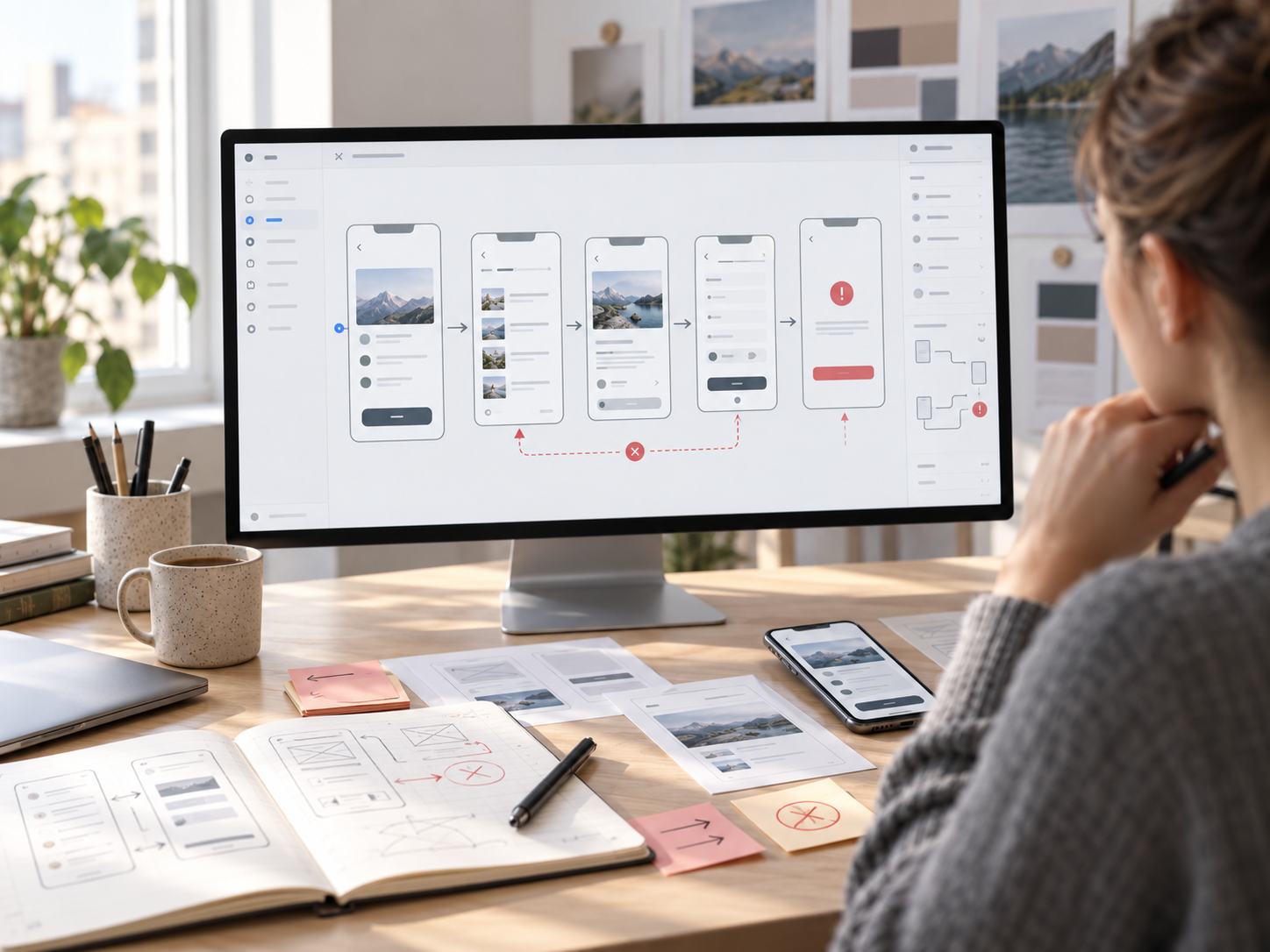
In recent work I had to add success states, errors and other intermediate states after the main flow already looked complete. It was a useful reminder that a complete prototype cannot be judged only by its primary screens.
The less glamorous states are still part of the product.
A practical interaction QA pass
Before I call an interactive prototype finished, this is more useful than replaying the same ideal flow once:
- Use a mouse on desktop.
- Use a finger on a real phone.
- Try keyboard access where controls should be reachable.
- Interrupt movements halfway through.
- Repeat the same action quickly.
- Move back and forth between states.
- Test slower loading or missing content where relevant.
- Check errors, empty states and confirmations.
- Provide an alternative to dragging or complex gestures where the function depends on them.
- Check whether the product still makes sense when motion is reduced.
This is internal interaction QA, not a substitute for usability testing. A control can work technically without proving that users understand it, notice it or choose the intended action. Those questions require testing with real users performing concrete tasks.
The checklist is not a replacement for technical testing either. It catches a useful class of problems before a prototype is presented as more complete than it really is.
A prototype should prove more than appearance
A prototype becomes more valuable when it answers a specific question.
Can this navigation actually be used with a finger? Is the next step understandable? Does the state survive an interrupted transition? Do the controls work across input methods?
If the only answer is that the screen looks right, the prototype has mainly tested the visual layer.
That is useful, but it is not the same as testing product behaviour.