First impressions shape judgement
A calm, considered interface can create trust before a user has completed a single task. That matters, but it can also make an evaluation less precise.
Nielsen Norman Group describes the aesthetic-usability effect: people tend to perceive attractive products as more usable. They may tolerate minor problems for longer, but an appealing visual style cannot repair serious navigation or functional issues.
Observe actions as well as comments
In a usability test, a participant may say that a solution feels simple while taking a long time or choosing the wrong path. We therefore need to compare what people say with what they actually do.
A useful test begins with a specific task. Can the person find the relevant function? Do they understand what happens after selecting it? Can they finish without help? Comments about colour and style are valuable, but they answer a different question.
Relief App as an example
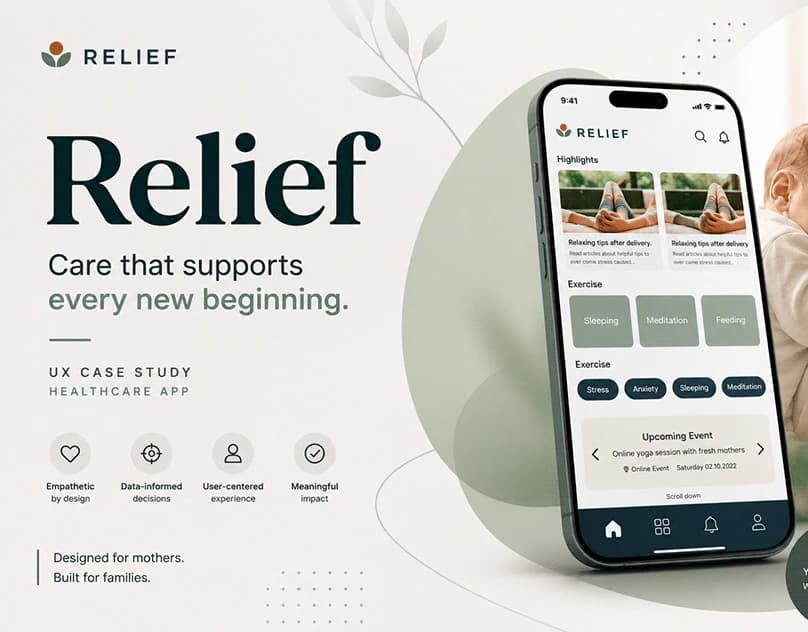
Relief App is a UX study containing user flows, wireframes and a calm visual interface for a support application. It shows how colour, spacing and visual priority can support a reassuring tone.
It is not evidence that every task is easy to complete. That would require testing the solution with representative users and defined tasks. The project is used here as a design example, not as proof of a measured effect.
Balance form and function
Visual quality is not decoration added at the end. It can make information easier to scan, show relationships and create confidence. It should, however, work with clear language, recognisable controls and a logical sequence.
When reviewing an interface, I therefore ask both how it feels and how it performs. The first impression may persuade someone to try it. Actual usability determines whether they can continue.