Design
What makes a product visible on the shelf?
Visibility is only part of the task. Packaging also needs to make the product and variant easy to distinguish from nearby alternatives.
Concept project, Packaging
A dairy packaging concept with shared typography and a different colour for each product type.
View on Behance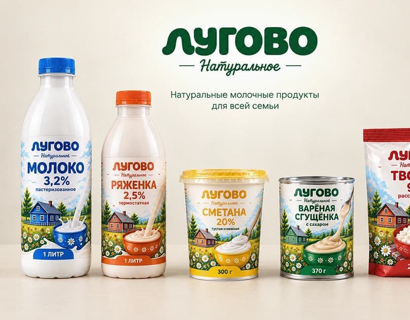
I present LUGOVO to show how a product family can have a clear shared brand identity while making its variants easy to distinguish.
I developed the packaging system, typography, colour coding and layouts for five dairy products.
A product family needs both a recognisable shared identity and clear distinctions between variants. This is a design assessment of the packaging challenge, not a documented retail study.
A family of packages balancing brand recognition with variant information, designed to extend across additional products without losing consistency.
A consistent information grid connects the series, while each product category has its own clear colour.
Typographic hierarchy, repeatable placement of identity elements and differentiated colour can create two reading levels: recognition of the product family and identification of the individual variant. Specific design claims should be checked against the original project images.
The series maintains the same brand identity across products, while colour coding makes variants easier to distinguish.
This is evaluated as a packaging-system proposal. No sales uplift, shelf testing or consumer-research results are claimed.
Design
Visibility is only part of the task. Packaging also needs to make the product and variant easy to distinguish from nearby alternatives.
CONTACT
Krigsjåveien, 5163 Bergen, Norway