Three different questions
Does someone notice the packaging? Do they understand the product? Do they choose to buy it? These are separate questions. A strong colour or a large logo is a design decision, not evidence of sales.
I would start a packaging review with a specific task: find the right product and variant among several alternatives. That gives the discussion a purpose beyond choosing the most attractive presentation.
What research can contribute
In a 2024 preprint, Hosseini and colleagues describe a method combining logo detection with predicted visual attention on packaging. The method predicts what may attract attention. It uses a computer model, rather than observations of people shopping for LUGOVO.
LUGOVO as a design example
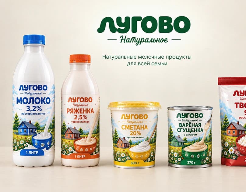
LUGOVO is my conceptual dairy packaging project. A shared layout and consistent typography connect the range, while colour coding differentiates product types. It illustrates how a system can combine common elements with variation.
For a range like this, I would check whether product names remain clear without the colour coding. Colour can support navigation, but the text must also explain what is inside. Small digital previews and actual-size printouts provide different checks.
A practical investigation before production
Place the proposal alongside relevant alternatives in a realistic shelf presentation. Ask participants to locate a particular variant without first explaining the design. Record mistakes, questions and the cues they use. Repeat with a revised version and compare the same task.
This is a test I would run before production. LUGOVO remains a concept shown through mockups, without shopper testing or sales data.